Lowering the barrier to social impact for art hobbyists through a UGC submission flow design
Problem
Hobbyist artists want to use their creativity for good, but there is no clear, accessible pathway for them to contribute to social impact.
How might we support art hobbyists to easily participate in social impact work through their creative practice?
Research
Why does the motivation exist but the action doesn't?
We needed to understand the drivers and barriers for artist participation in social impact. To dig deeper, we conducted a user survey to explore the breadth of hobbyists' interests, behaviors, and past experiences.
Key Findings
Artists need supportive, low-friction spaces that validate small creative acts.
Through the 32 survey responses we received, we grouped the responses based on the common feelings of artists we could identify and came up with these 4 insights.
01 Impact
Artists want to help but doubt their contribution matters, because impact is never made visible
"I believe in participating in social causes, though I am not sure how much of an impact my creativity could have"
02 Community
Artists participate more when they feel supported, not judged, because confidence is a major barrier
"I don't think it's very good, not sure if others would be interested"
03 Seriousness
Artists hesitate to start because they feel their work isn't "serious enough" for social impact
"It would be cool to contribute, but I don't think I'm cut out for creating serious and important content. I create more for laughs and for fun."
04 Joy
Artists create for joy above everything else, because that's what keeps them coming back
"I create art to make my activities more enjoyable"
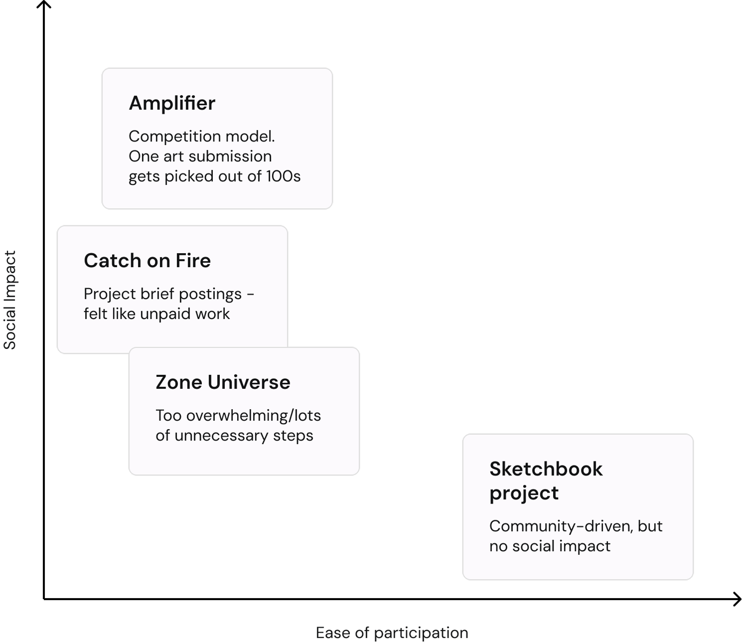
Competitive Analysis
Every existing platform in the market felt either like a competition or unpaid freelance work.
I used perplexity AI to run a competitive analysis on existing platforms and analyzed four platforms to evaluate their onboarding flows, identify emotional friction points, and how they alienate art hobbyists.
The landscape revealed a polarizing market gap: platforms built for social change are designed like sterile job boards or exclusive competitions, while platforms that feels joyful and welcoming completely lack a mechanism for social impact.
We were making the same mistake
Through some early stages of ideation, we had come up with a direction for our product. Artists pay to have their "doodles" displayed as stickers - funds donated to social causes - stickers sold for free
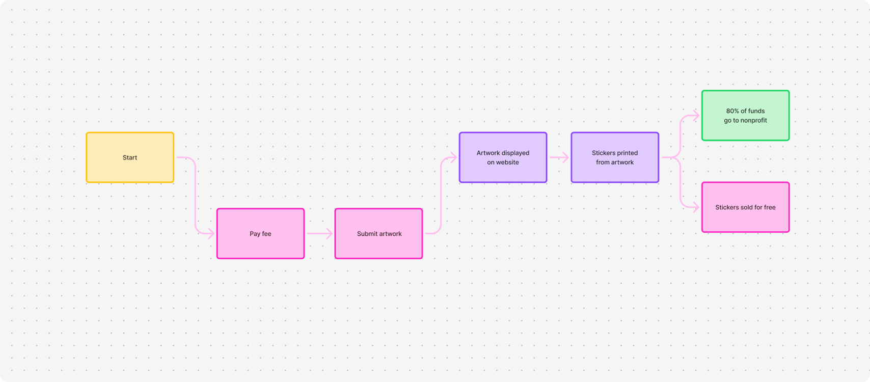
Original business model
Why would an artist pay to submit their work to a platform nobody had heard of when they could just donate directly?
I realised that our product was accidentally building a new wall. From my experience in customer success, I knew that people are far less likely to act when there's no established relationship yet. We had no credibility or proof, no reason for an artist to pay.
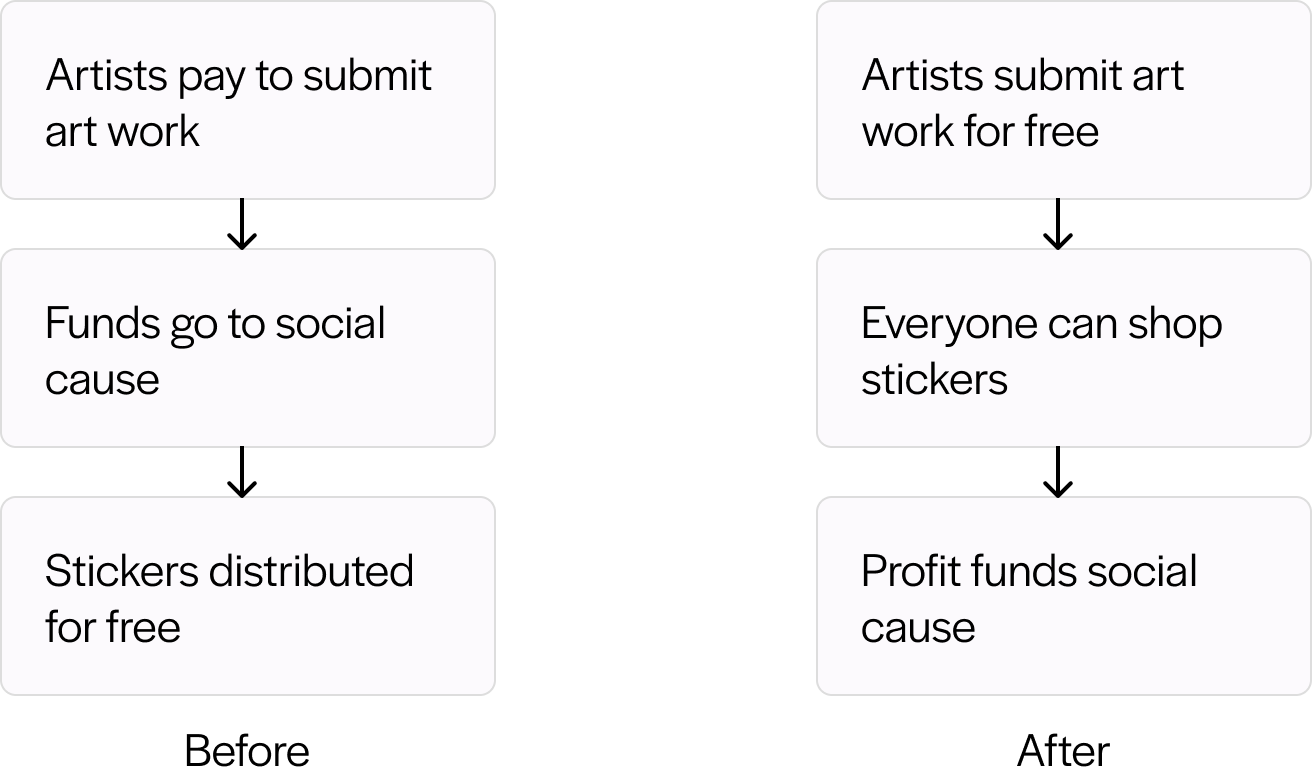
I proposed flipping the model - free submissions for artists and sticker purchases for everyone. Lower the ask for the person we most needed to show up, and let the community fund the impact instead.
Ideation
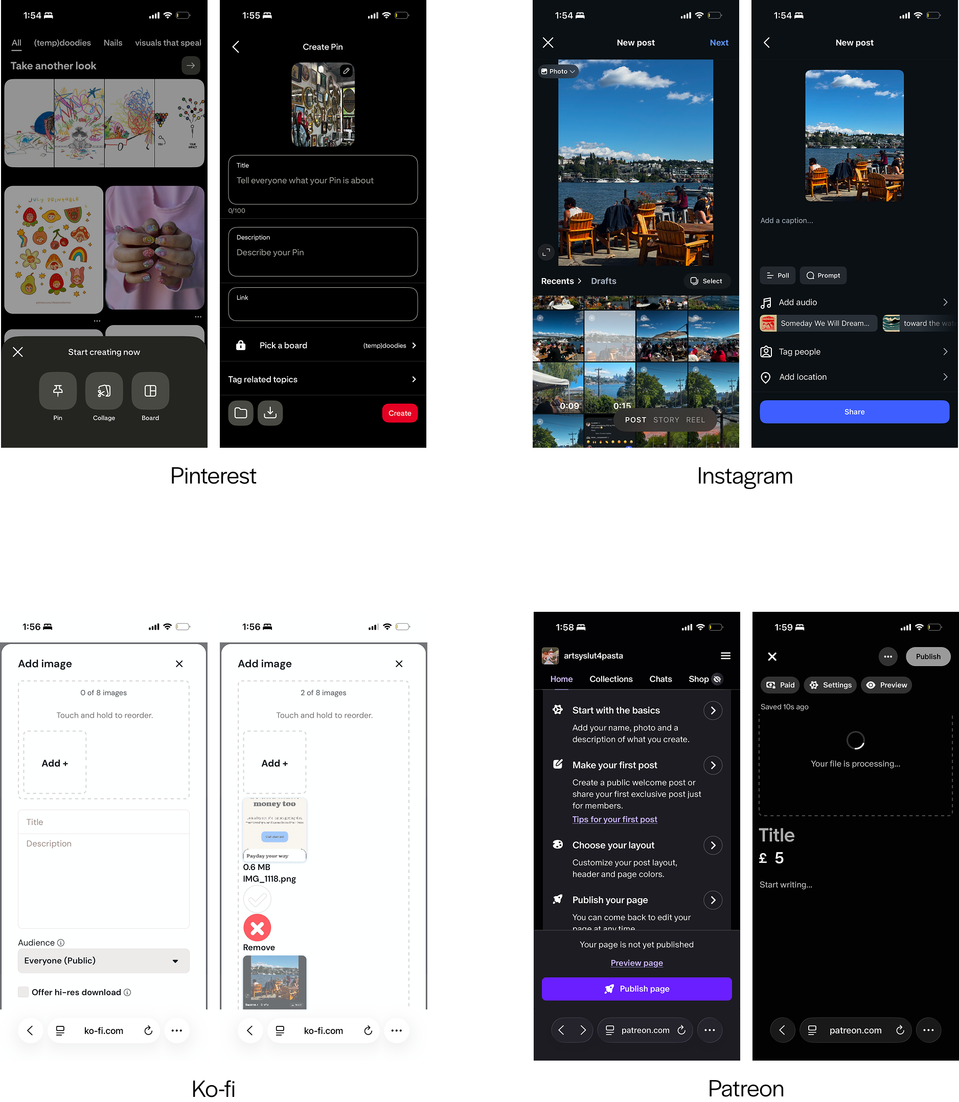
With the foundation set, I began exploring different submission flows to understand what the artists were already used to.
I looked at Ko-fi, Patreon, Pinterest, and Instagram - four platforms where artists share their work frequently to map what worked, what created friction, and what I needed to avoid.
Design Principles
Principles that guided my design
Based on the findings from research and my own exploration, I developed these three design principles to inform my design decisions.
Design for emotional safety and joy
Focus on belonging over participating
Reassure users that their contribution actually matters
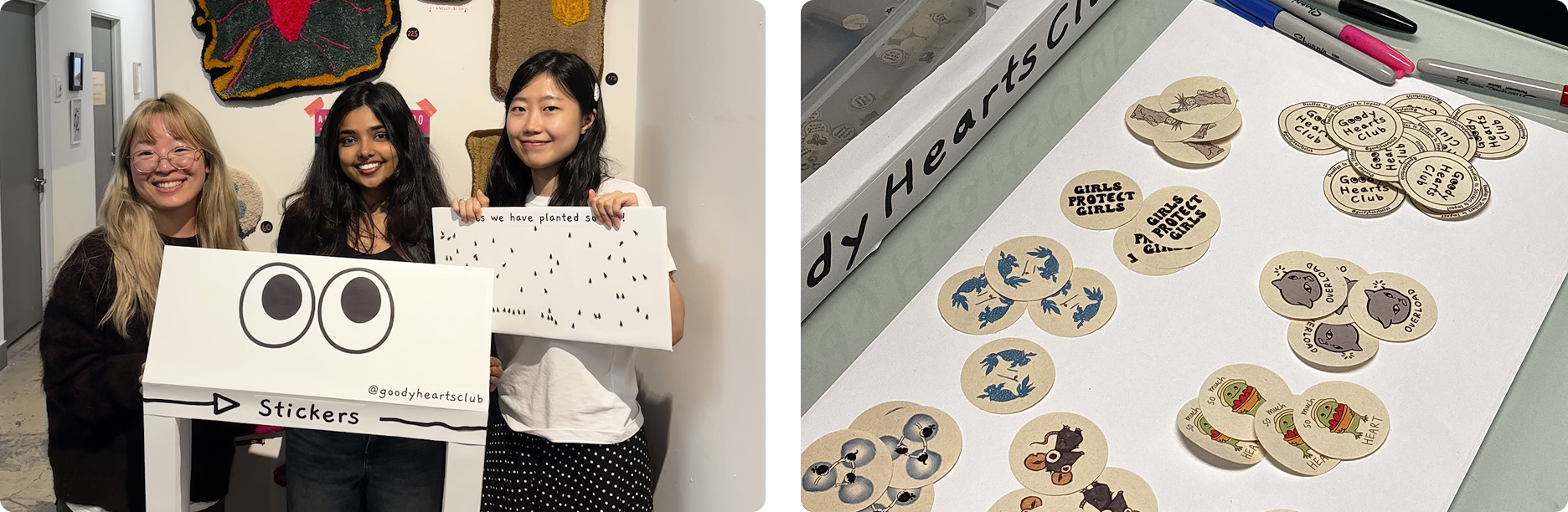
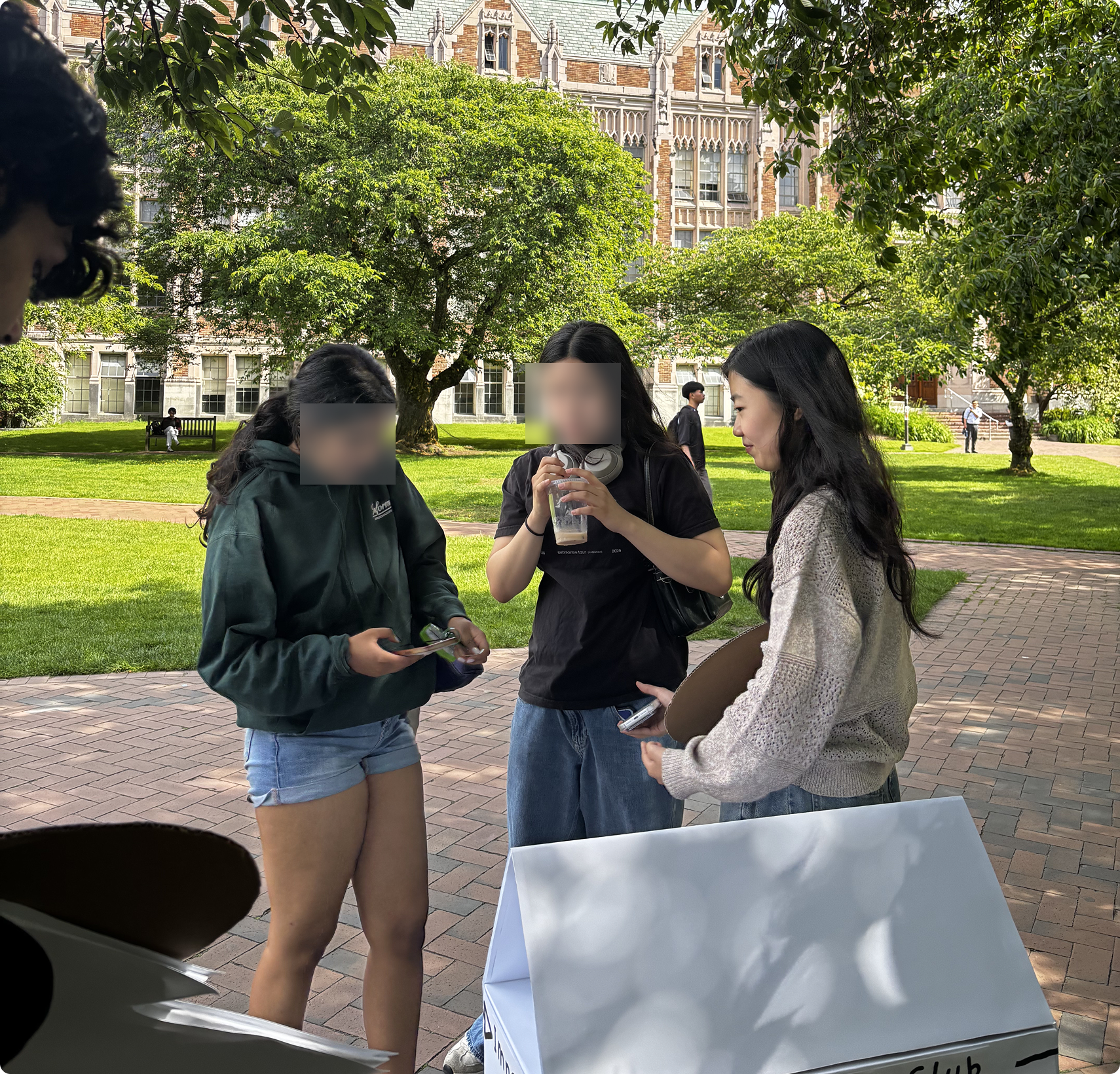
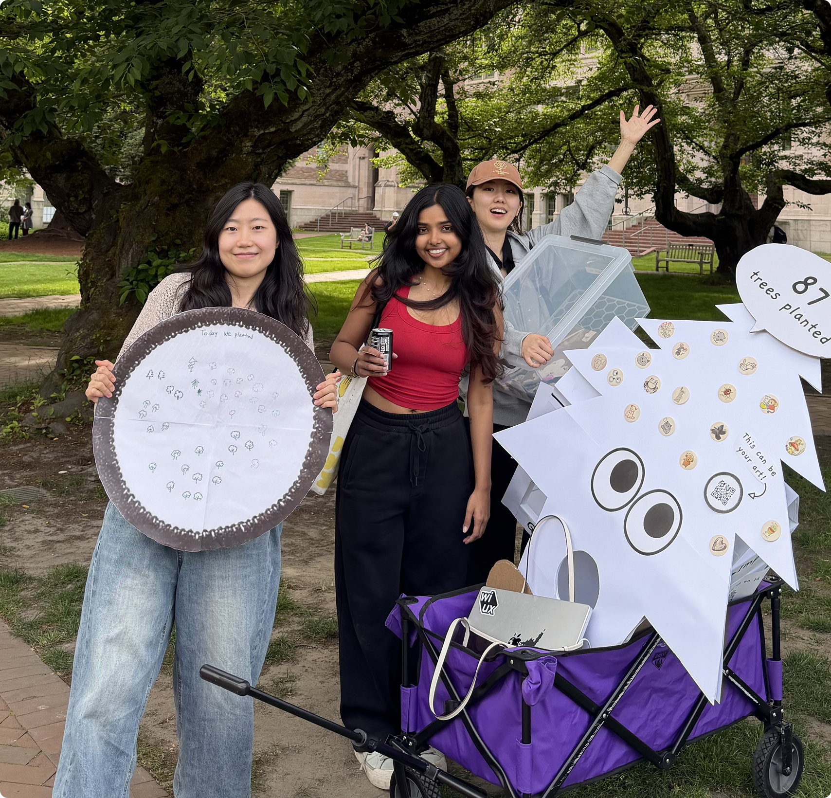
Meanwhile, we launched her first physical booth and sold out !
Design
The result - a submission experience built around how artists think and feel
01
Designing for belonging
Our physical booth proved impact draws buyers. But artists needed to feel essential - our homepage had to show that their art is what makes this possible.
Final design
02
Reducing decisional friction
Observation
Artists hate choosing their own work
Pre-launch of our website, almost every artist sent multiple doodles to us and wanted us to choose what to sell.
Insights
Choosing triggers perfectionism.
Forcing one upload makes artists judge their own work, which might trigger decision anxiety
Action
Multi - photo upload
Artists should be allowed to upload up to 5 photos so they don't have to pick their "best" work
Here's how that translated into the submission screens.
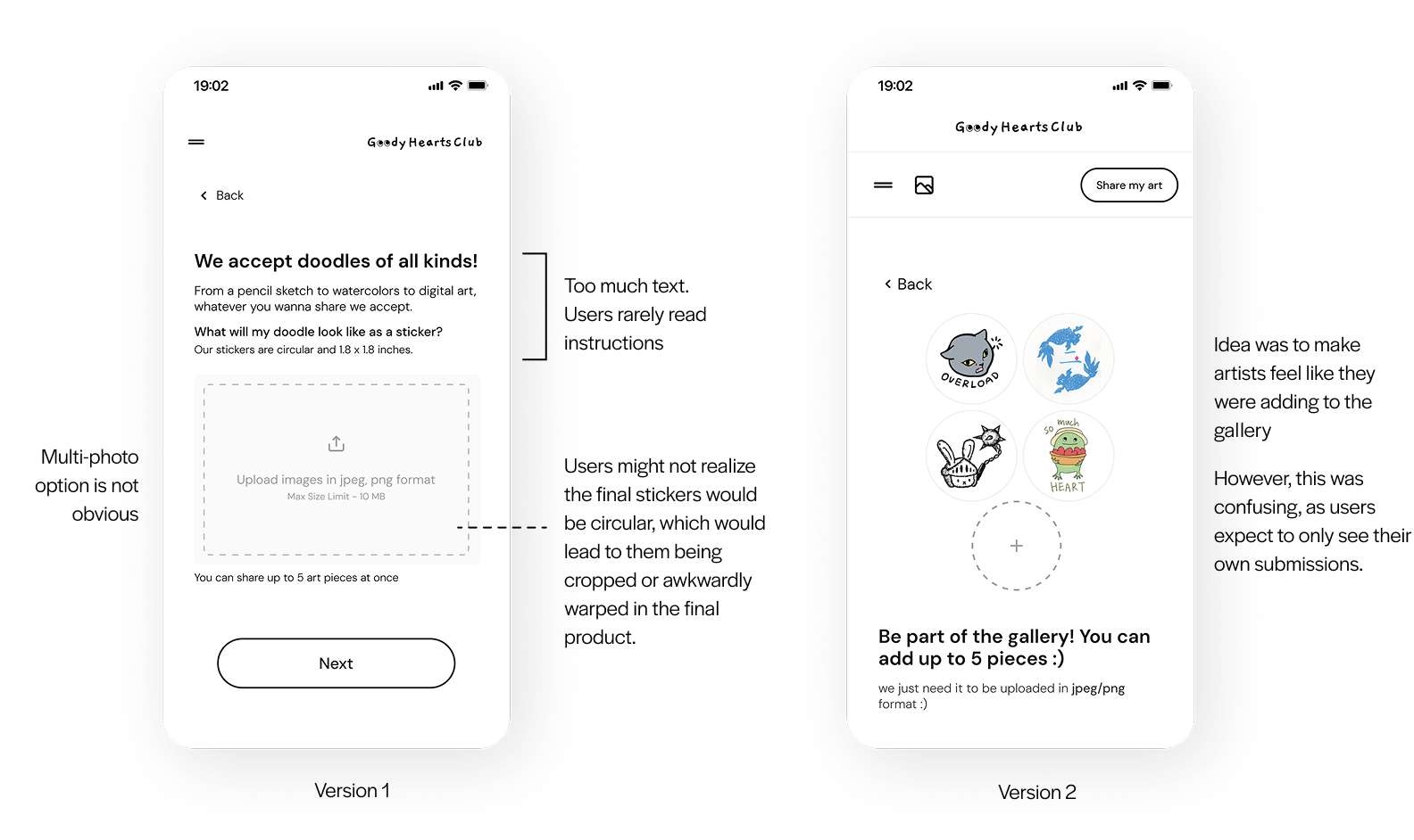
What I finally ended up with
03
Designing for joy - a little motion design experiment
In an experience built around minimizing vulnerability, a simple "Submission Successful" would have felt transactional and completely misaligned with the emotional weight of a artist adding their work to a charitable cause.
To create a moment of genuine joy, I collaborated with my teammate and we designed a custom animation.
This Closes the Anxiety Loop
It rewards the creator with immediate visual and emotional feedback
Symbolizes the action Value
The animation acts as a direct metaphor for the artist's impact on the social cause. Without their art there would be no stickers to plant trees
04
Reducing user effort
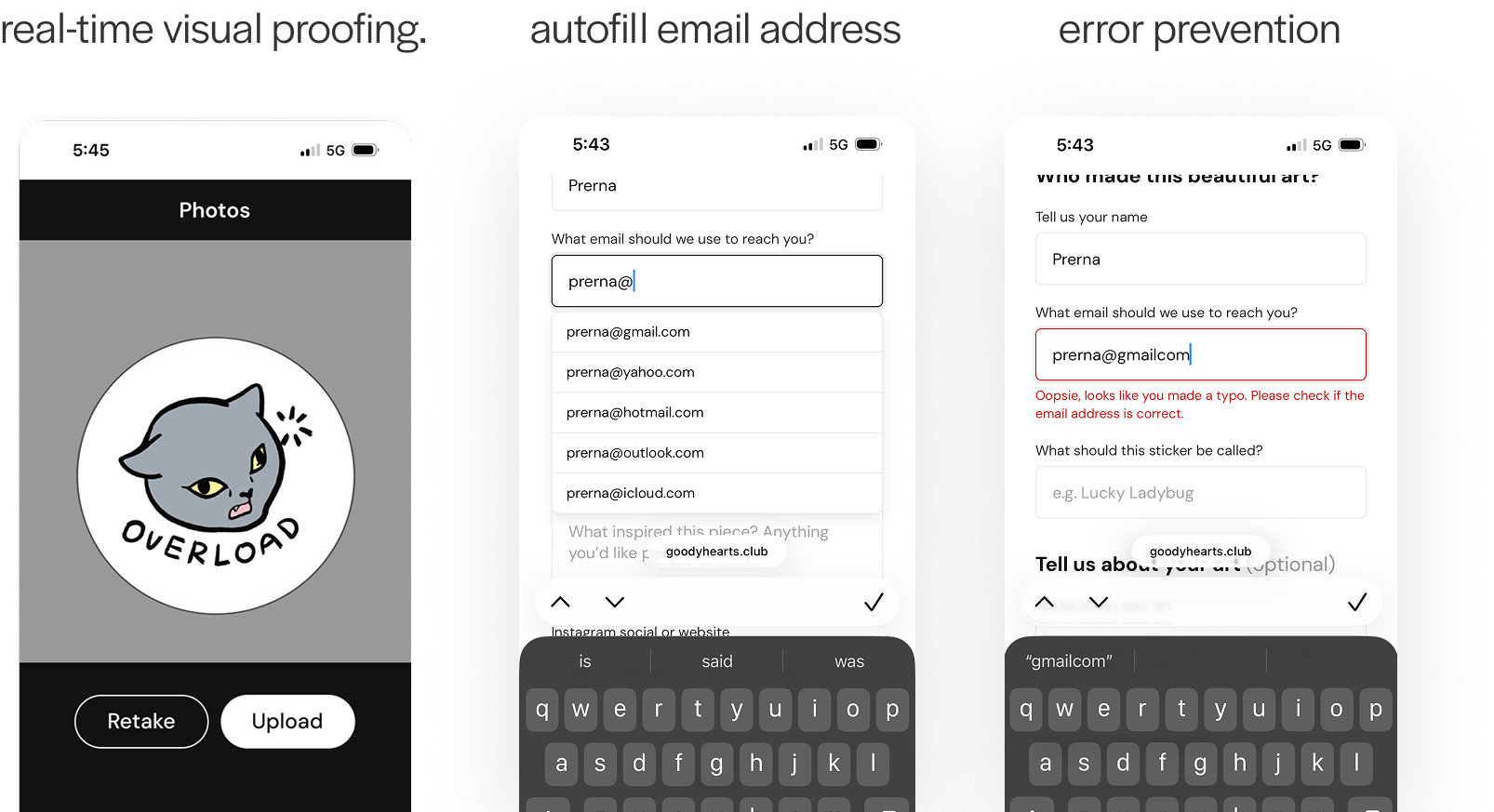
To reduce input fatigue, the email field automatically populates the moment a user types @ I also designed an interactive circular crop tool directly within the preview, allowing artists to scale and position their design with real-time visual proofing.
Usability Testing
Validating User Confidence, Reassurance, and Perceived Clarity
To understand if there was a gap between my design intentions and real user perceptions, I ran 5 usability tests focusing on the emotional and cognitive experience of the artists. I wanted to understand how users felt navigating the platform.
01
Making art feel more personal
During testing, participants repeatedly tried clicking on the stickers in the gallery, expecting a response. So here's what I did.
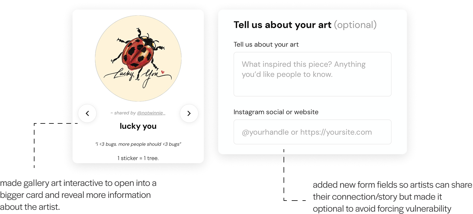
This behavior revealed a desire to connect with the work and understand the inspiration behind the art like people are used to doing in museums, which is why we adapted these features in our final design.
02
Should I add more drawings?
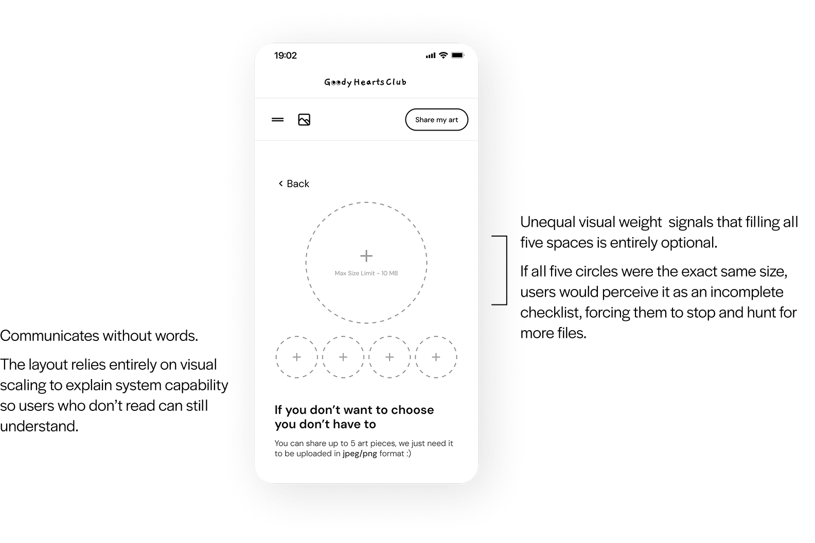
I initially kept empty slots on the details screen to make it easy for users to add more art, but it just caused confusion. It made participants feel like they needed to upload more artwork.
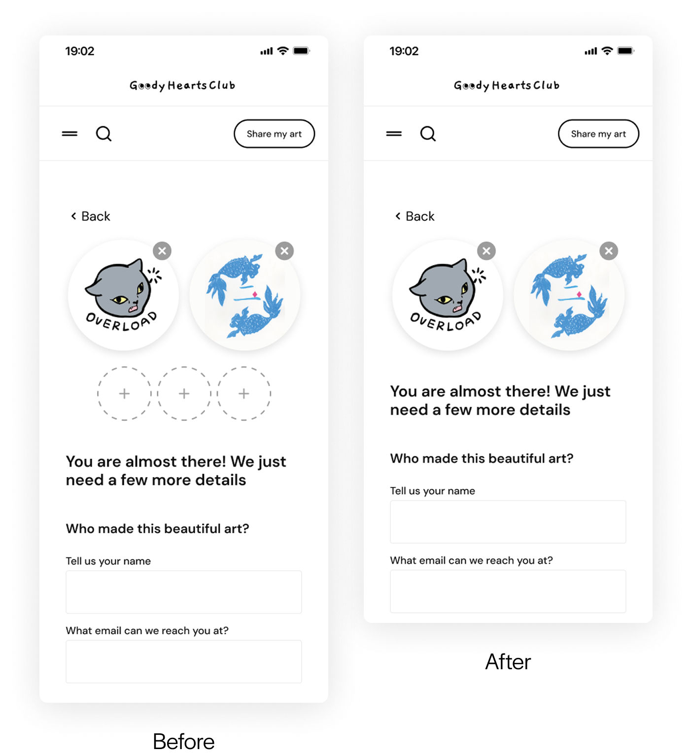
Changed to - only show uploaded art
AI Experiments
Building consistency using Claude
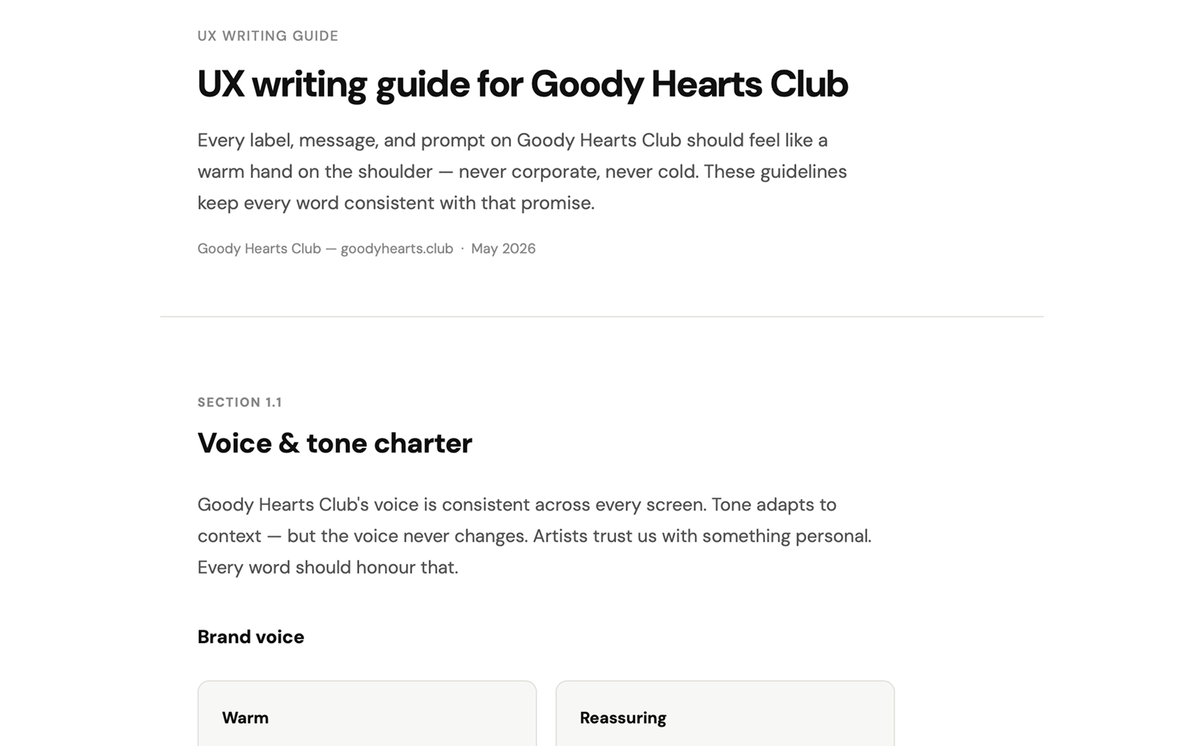
To ensure the tone remained consistently empathetic, clear, and reassuring across every touchpoint of the experience, I used Claude to build a comprehensive UX Copy Documentation framework.
What I learned
Working with AI requires a LOT of patience
Because we had to design and launch this product on a brutally fast timeline, I initially turned to Claude to create wireframes which led to generic outputs, what did work was using it as a design review partner bec AI is really good at catching patterns/auditing. It taught me that you have to constantly experiment with AI workflows to figure out what actually accelerates your unique process and what just hinders it.
Human connection is essential
Stepping away from the screen to watch real people interact with our product was such an amazing experience. Seeing them connect with the non-profit's cause and buy the stickers filled me to so much joy. It reminded me that we are building tools that impact real human communities.