Reducing Navigation Friction by 75% for B2B Pharma through a visual and structural redesign
Context
Panacea Biotec was expanding into Global Markets
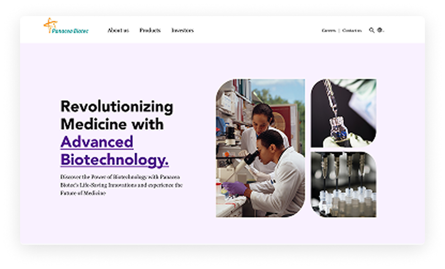
In response to their strategic expansion into international markets, I was tasked to redesign their website to reflect a modernized identity built for global partners and investors.
Problem
The Confusing navigation and Outdated UI posed a risk to partner engagement
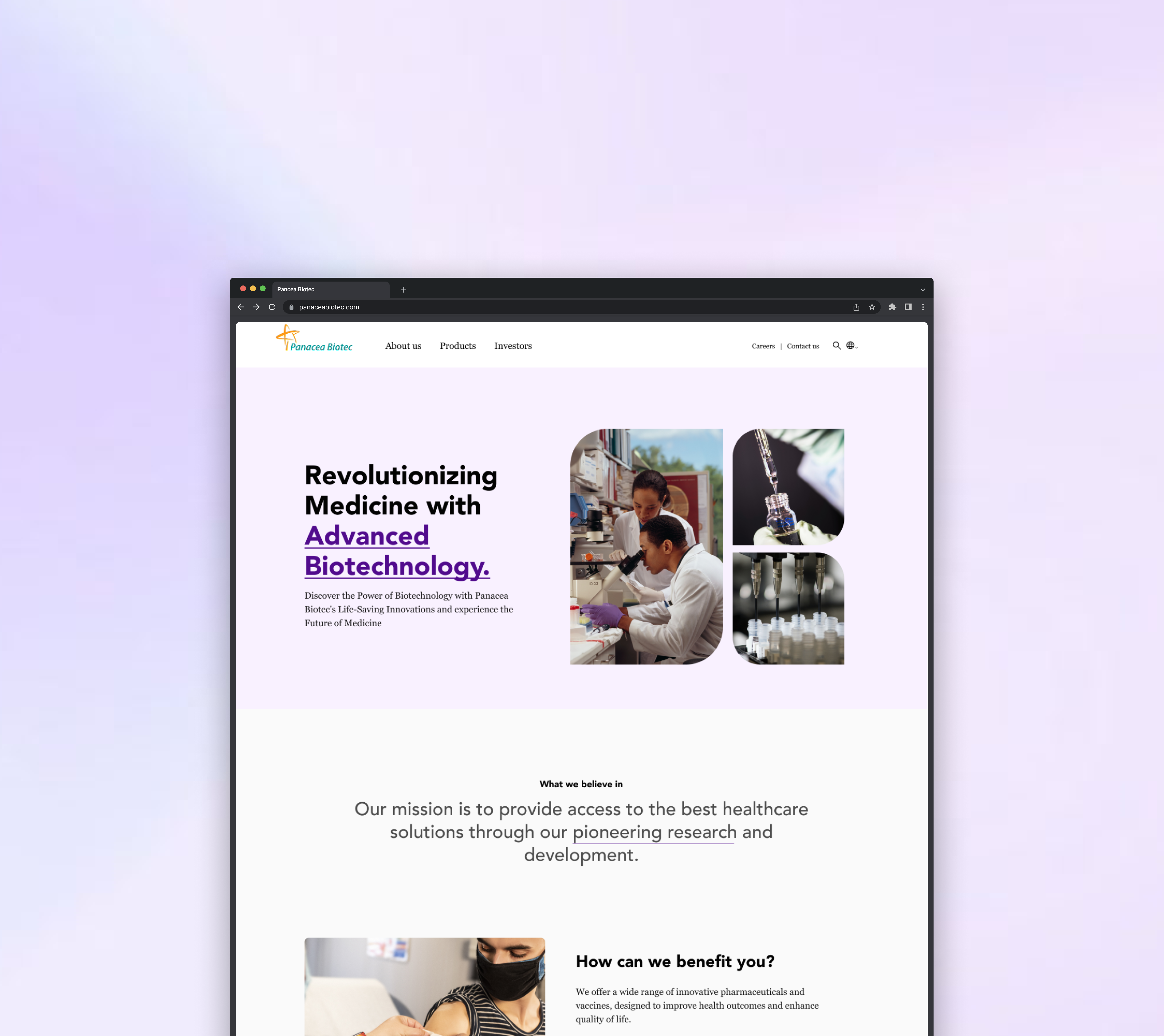
The existing interface was too crowded. As the company scaled globally, the goal was to move away from this cluttered layout and build a cleaner, more professional interface that clearly reflected their capabilities to a worldwide audience
Original Panacea Biotec website
Cultural Mismatch
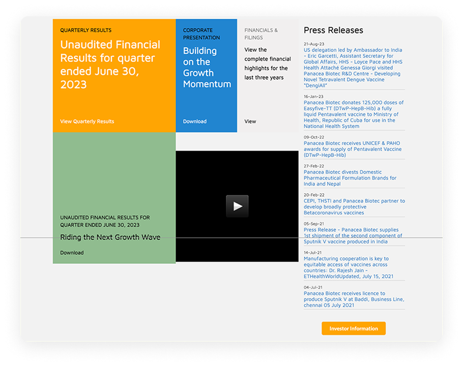
In India, particularly within healthcare, trust is often built through information density.
The original homepage reflected this: every available credential, press release, financial result, partnership announcement, and social feed was surfaced simultaneously
But in the US density reads as distrust.
Instead of building confidence the website was creating friction. It felt overwhelming and was obscuring key financial and product information
Research Method 1
Identifying Barriers to Global Engagement
To understand how these cultural and structural misalignments were impacting the user journey, I conducted a heuristic evaluation of the existing platform.
57%
The heuristic audit quantified a 57% usability gap between Panacea Biotec's current site and the global benchmark for a web interface
60%
of the issues identified were classified as 'Critical' - potential deal-breakers that stop target users from finding data.
While poor usability creates friction for any visitor, for global investors, it functions as a critical "due diligence" signal. Studies show that poor usability reduces trust and credibility which made this a plausible operational signal in B2B pharma diligence
01
Critical Information Was Invisible
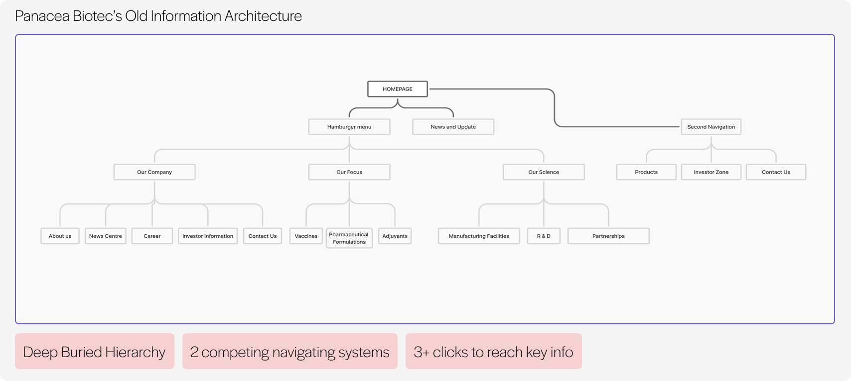
While Panacea Biotec's primary goal was to engage investors and buyers, the Product Portfolio and Financial Performance data, their most valuable assets were buried under navigation
02
Visual Inconsistency as a "Credibility Gap"
The interface displayed a lack of design logic, featuring four distinct button styles, three conflicting color systems, and mixed icon treatments which undermined the company's professional image

03
Cluttered UI
The homepage presented 14 content variations, mixing unrelated links, cards, and data points with no discernible logic ensuring no critical information stood out
Research Method 2
Competitor analysis revealed a clear structural gap.
I analysed the top 3 B2B pharmaceutical companies, mapping how they surfaced information, click depth to key pages, and how navigation guided users to relevant content.
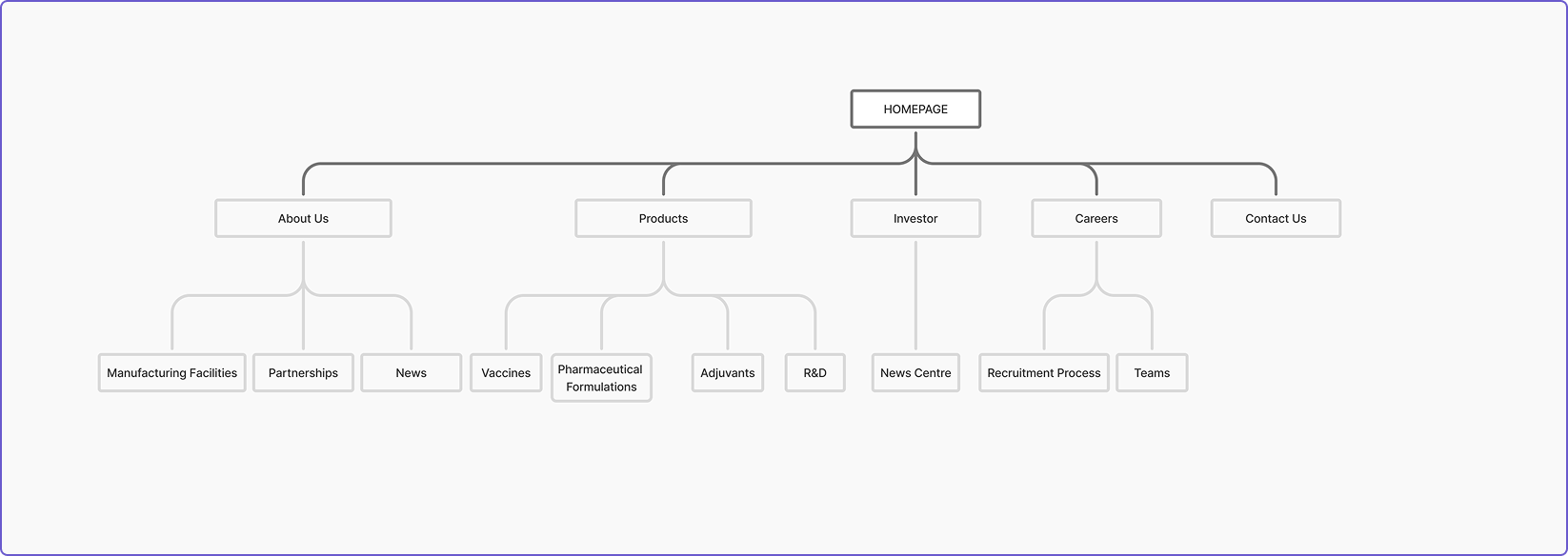
Panacea Biotec's Old Information Architecture
Ideation
Presenting the new structure
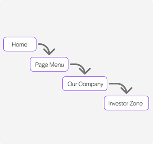
I proposed a streamlined, "flat" navigation structure. The goal was to eliminate the ambiguity of the original menu labels and drastically reduce the path to information for global users.
What Stakeholders wanted,
Stakeholders wanted more information surfaced at the top level, arguing that more items need to be visible in the navigation.
But I thought,
Adding more items to the navigation would have recreated the exact problem we were solving.
I redirected the conversation, asking stakeholders why those pages mattered to them. That question reframed the discussion from how much to what matters
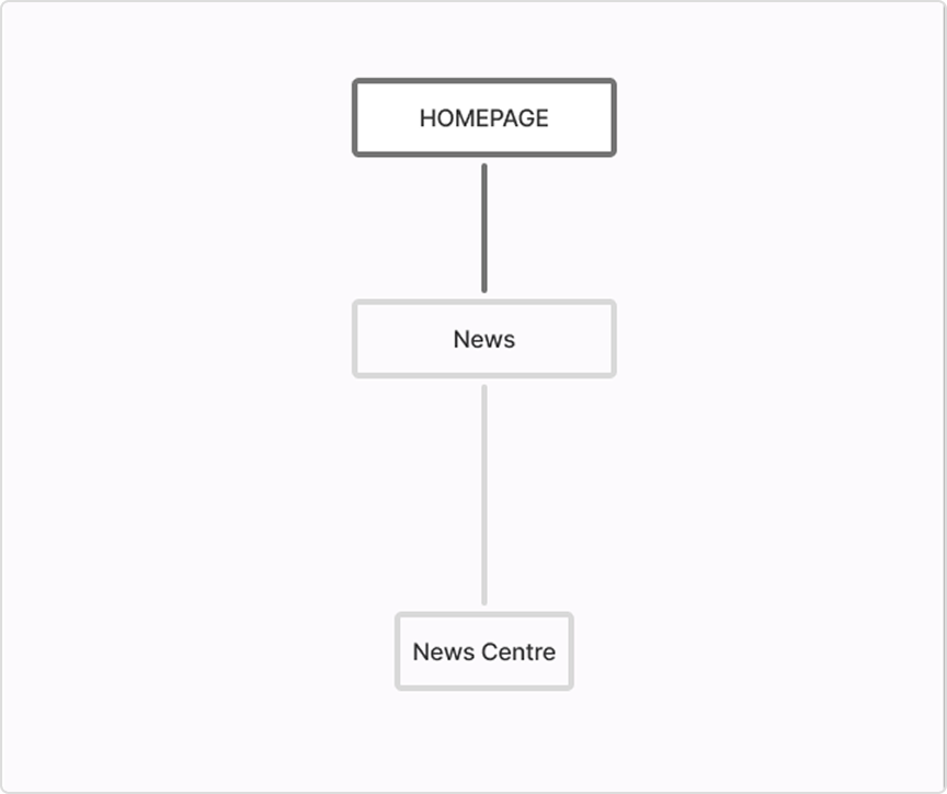

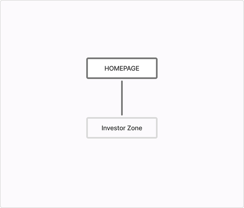
The outcome was a small change: News was replaced with Investors at the top level
- Navigation remained flat
- Reduced clicks to reach product information from 4 to 1 and investor information from 3 to 1
- Structure aligned to both user needs and business priorities
Design
Principles that guided my design
Based on the key findings from my research, I developed three design principles to ensure every design decision moved the company toward a global standard of trust.
Information Needs to be Scannable
Building Trust Requires Consistency
The Website Needs to Tell a Story
Setting the right foundation
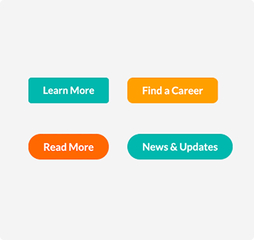
The previous interface was visually fragmented, with inconsistent UI. To build consistency, I centralized these disparate elements into a single, reusable Primary CTA Component with three defined states - Default, Hover, and Disabled, hence unifying the platform's interactive language.
Returning control to the user
Research by Notre Dame found that only 1% of visitors interact with auto-rotating carousels.
Auto-rotating carousels remove user control, content shifts before visitors have finished reading, creating unplanned interactions and confusing pathways.
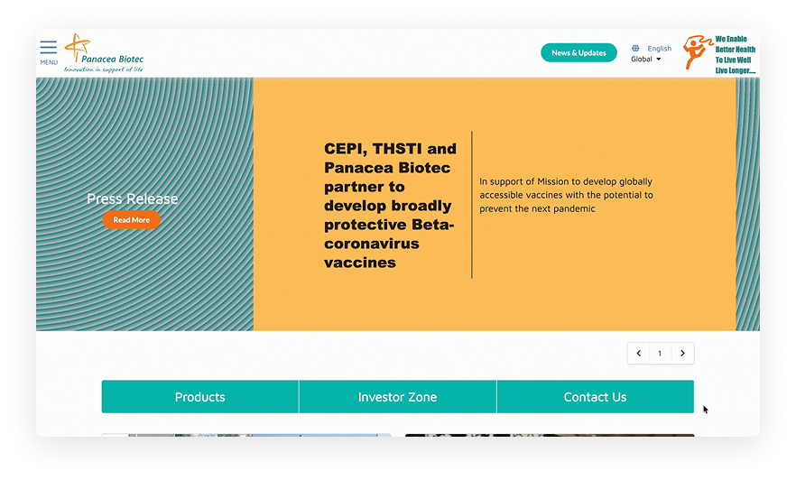
Before
After
I proposed replacing the auto-rotating carousel with a static hero section presenting a single clear headline about who Panacea is, giving international partners immediate context the moment they land
What Stakeholders wanted,
Stakeholders were resistant to removing the carousel, arguing it was the only way to display all their most important content "upfront and all at once.
But I thought,
However, I advocated for a static hero section, pushing the principle that when everything is prioritized, nothing is seen
To solve the "hidden information" problem, I advocated for moving the company's product portfolio out of the rotating slides and into a dedicated, product section immediately below the fold.
The Compromise: A Shift Toward Intentionality
Despite not being able to fully convince them, the conversation moved the needle. The final website kept the carousel but with two meaningful changes
- It no longer auto-rotates, giving users control over what they see
- The content was narrowed exclusively to products rather than a mix of financials, events, and brand messaging
Strategizing for Impact
Panacea Biotec possessed an extraordinary portfolio of scientific breakthroughs and financial milestones yet it was completely hidden. The current interface presented a "wall of information" where information was buried among unrelated videos and press releases.
I introduced a tabbed structure - Press Releases, Quarterly Results, Financial Filings allowing each visitor to navigate directly to what was relevant to them without processing content meant for someone else.
Before
After
Final Design
By adhering to the new design system and information architecture, I achieved four critical shifts in the user experience
01 Important information moved to the surface
I replaced the hamburger menu with a flat nav, reducing clicks to the Investor/product section from 4 to 1.
02 The page had a hierarchy now
The page now followed a purposeful narrative journey: Identity → Capability → Partnership → Credibility
03 The visual system became coherent
I implemented a unified color system and a standardized type scale. The company now looks like a single organized entity.
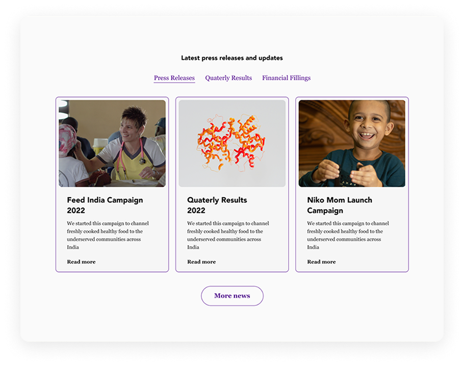
04 Content was now scanable
Press Releases, Quarterly Results, Financial Filings were now separated into clear tabs. Someone doing due diligence can now find exactly what they need.
Reflection
The Designer Who Asks the Most Is the Most Prepared
This was my first big UX design project, I held back from asking stakeholders too many questions because I was afraid of seeming underprepared. What this project taught me is the opposite is true. The designers who ask specific, informed questions are the ones who appear most confident because they understand the problem before touching a design tool.
Questions are the work
I approached this project with the instinct to show up with answers. What I didn't understand yet was that asking the right questions upfront is the actual design work. Designing without stakeholder clarity isn't initiative — it's assumption. And assumptions create rework. I had access to stakeholders throughout this project. I didn't use that access enough.